
Cloud Native DevSecOps Platform
Empower Your Cloud Native Transformation
Deliver better, more secure and compliant cloud native software faster than ever.
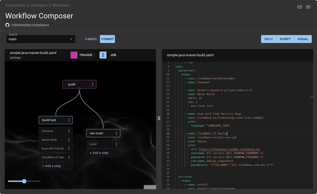
Frictionless development
Minimize developer toil with self-service access to fast, secure workflows and GitHub-style actions running on Tekton.
Faster and safer
Deliver software faster with built-in security and compliance checks at every stage of development and deployment.
Continuously improved
Be your best with constant feedback loops across the entire software delivery value stream - no more intelligence gaps and localized insight.
Driving DevOps success from code to customer

Up to
Engineering hours saved
Up to
Deploy and release software faster
Reduce
Build and development time
Up to
Reduction in development cycles
See what our customers have to say
See what our customers have to say
“With CloudBees you get quality, consistency and reliability thereby allowing your developers to focus on developing. That means we are producing more value for our clients and customers - which is our key objective.”

Director of Technology
“With CloudBees, we can deploy releases 80% faster, and we can invest that time in other projects."

Director, Solution Architecture Team
"Switching to CloudBees CI meant we no longer needed to maintain 35 to 40 static Jenkins agents. This has made tremendous sense in terms of time and cost savings."

DevOps Engineer
Resources and Events
Explore the world of CloudBees by signing up for events, tuning in to our webinars, and diving into our captivating content. Expand your knowledge and make the most of our valuable resources.